There will be many scenarios where you will have to create Tableau Donut Pie Chart to visualize the data. The pie chart is directly available in Tableau but creating Tableau Donut Pie Chart can be little tricky.In this post, I will explain step by step procedure to create a Tableau Donut Pie Chart easily. Again we will consider the sample order data available with us and will make donut pie chart in Tableau. Just follow the steps and I am sure you will be able to make the same.
What is a Donut Chat in Tableau?
Donut chart is technically a Pie chart with a hole in the middle. And you can use that hole to put a nice label which was kept blank in a pie chart. Just go through the below example and you will be able to understand more clearly. Here are the simple three steps to create a donut chart which will see in the example as well.
- Create a pie chart
- Overlay a blank hole in the middle
- Add label on the blank hole
Tableau Donut Pie Chart – Step by Step Tutorial
Let’s start and see how to create donut pie chart in Tableau. This is the simplest tutorial to start with Tableau Donut Pie Chart and we will use the same order sample data provided by Tableau.
If you’re unable to find the data, you can check that in Documents\My Tableau Repository\Datasources\10.2\en_US-US folder. The folder structure may change depending on where you have installed Tableau.
Now just follow the below steps and create the Tableau Donut Pie Chart.
Step 1: Connect the Data source
Just connect the same excel file to Tableau and select the “Order” Tab. You will see the data preview. Now jump to the worksheet. You can rename it if you want else by default it will be sheet1.
 Step 2: Add Sales to the Rows
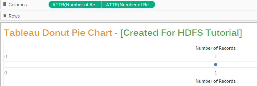
Now we need to create the Tableau donut pie chart. Once you will be in the worksheet, you will find dimension and measures in place. Just drag the “Number of Records” from Measures pane to the Rows shelf twice.
 Now by default, the “Number of Records” will be SUM(Number of Records) as you can see above. We are not looking for sum and so just click on the drop down of the column field of both the records and select “Attribute” for both the fields. Now you will have the worksheet like below.
 Step 3: Select Dual Axis
We have both the fields same and so there is no meaning to show two graphs and so we will select the dual axis. Just click on the drop down of second “Number of Records” field and select “Dual Axis”.
 Step 4: Select the Pie chart
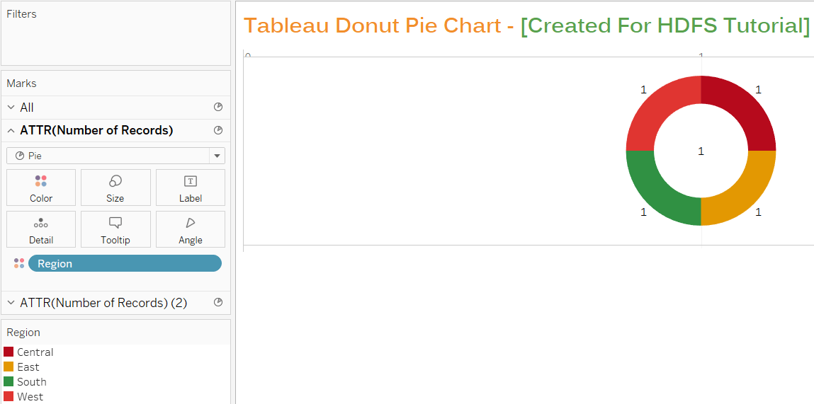
From the mark pane, select pie chart for both the measures. And make the changes in the size of the pie chart and the color so that you will be able to see the difference between both the fields.
I have selected the bigger size for the first measure and color as Green while white color for the second measure and small size. Also, I have shown the label for both the measures. Once done, you will have the graph looking like below.
 Step 5: Add Region to Colors
Now add the Region Dimension to the color of the first measure. This will divide your pie chart into a different region. You can also change the color palette as you want.
 Step 6: Add Sales
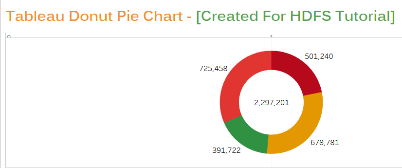
Now Add Sales measure to the first Marks so that you will have a clear difference. Also, add the sales measure to the text of second marks. You will have final Tableau donut pie chart like below.
 This was all about how to create donut pie chart in Tableau. I hope using this simple tutorial you are able to create a Tableau Donut Pie chart easily. Try this Tableau Donut chart and let me know if you had any issue while doing so.
Also, if you liked it, please share it with others on Facebook.


Leave a Comment