Data in presentations is often presented in the form of numbers or tables. Sometimes as a screenshot copied directly from a spreadsheet or report documents. Other times as tables inserted in PowerPoint. However, the appropriate presentation of data with charts or graphs can be interpreted easier by the audience and the use of this form of representation can facilitate making decisions. This helps toward making effective presentations that are easier to understand and interpret.
A variety of data charts is available in popular presentation software. Some charts are more appropriate for a certain type of data being presented, while other charts are more appropriate in other cases. Ensuring that an appropriate chart is picked for your presentation, can result in a better presentation and facilitate it to be an effective medium to communicate information to your audience.
For instance, instead of using a plain table to represent the revenue growth in a startup, this information can be modeled with charts. The upward curve to the right will help the audience to easily understand that the company’s revenue has been increased.
In an opposite way, showing a drop in sales or a fall can also be modeled in a more visually appealing way than using just a table. An example of this case is presented by Gartner while showing the Worldwide PC Shipments by Device Type using bar charts with multiple series (shown below).
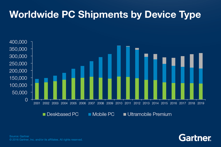 Source: eWeek – Gartner
There are plenty of resources online where you can get visualization ideas for representing data in a visual way. When it comes to presentations, the PowerPoint templates will be a timesaver, especially for users who use Microsoft PowerPoint to prepare and deliver their presentations. The same applies to other presentation software and tools, such as Google Slides or Keynote.
There are many different data charts to choose from for representing the different types of information. Here is a quick overview of some of these data charts, as well as some useful presentation templates and resources that can be used to model your data in a more visually appealing way.
Bar and Line Charts
For a single column chart, you can easily value data vertically with a uniform width. Keep in mind that the height of the columns varies to reflect data values. One can go for a simple bar chart that is used to present similar types of information in both horizontal and vertical columns.
 Stacked Columns
Also, referred to as a component column, it provides an analysis of the components. The figure of this chart is represented by the height of the column where the column bar is divided into various components. Each part is identified by different colors, patterns, and shading. Pie charts are effective in such examples.
Scatter Diagram
Scatter diagrams are used to plot two sets of numbers and have two numerical axes representing two variables. With the help of this diagram, a particular output level is clearly defined. The points in the scatter diagram are used to estimate a trend and a trend line. You can add it to your presentation for providing useful information.
With so many types of charts and diagrams available, make sure that the chart or diagrams you choose effectively communicate information to the audience. While you learn it, your statistics and figured would be cleaned thoroughly. There would be no need to go with estimation.
So, now you have come through the basic use of diagrams and charts, now step towards the exclusive data, curve, and charts.
PowerPoint is one of the most popular tools used worldwide to prepare and deliver presentations to an audience and convey a message. Professional PowerPoint templates can help to make robust presentations with a powerful impact on your audience. Creating a presentation with charts and diagrams is a challenging task for business projects. This is mainly because charts and diagrams are high-value elements in a structured manner. Fortunately, there are plenty of resources available to help to streamline the presentation design process. You can utilize the following presentation templates easily.
Infographic Dashboard Elements PowerPoint Template
This infographic PowerPoint template provides a unique data charts dashboard for PowerPoint. With 12 slides, the user can avail of a wide set of pre-designed infographics.
 The beautiful icons and clip arts of this slide enhance the graphic display and help achieve the objectives. It helps present the nitty-gritty statistics in an interactive and engaging approach.
Flat Sales Dashboard PowerPoint Templates
In present times, visualization has emerged as a modern business language. All the graphs, maps, diagrams, dashboards, and infographics are applied to surpass text to help executives better understand their business. Data visualization is imperative for the corporate world. Dashboards are the set of visualizations and are structured with the summary panel, weekly sales, product share, and more.
 Creative Dashboard Design for PowerPoint
It provides a great platform for business presentations. The template has the capability to deliver real-time visibility. You can use data charts for resource handling, management, and project planning. With a beautiful gradient background style, the dashboards add interactivity with no hassles. It features data value and graphical display.
Flat Vintage PowerPoint Dashboard
Get ready to create professional business analytics presentations with a vintage look. This superb template provides a data-driven infographic element that is ideal for generating dashboards. This template includes a data-driven donut chart, world map chart, Venn diagrams, matrix infographics chart, data-driven PowerPoint Column charts, and more.
Flat Editable Triangle Infographic
Infographic is a simple way to enhance visuals. Through this template, you can describe segments of a statistical population. The concept behind the main triangle in it is to represent the whole set with different figures and analyses. This template is fully editable and advanced. It is easy to understand represent the data and information.
In this article, we have reviewed many different data charts available for presenters. Also, some presentation templates for representing data in a visually appealing way were described. Even if these templates are available for Microsoft PowerPoint, there are some other resources providing templates for other presentation tools, such as Google Slides themes and Keynote templates. Using the proper design elements and templates, professional presentation decks can be created without the need for any design skills.


Leave a Comment