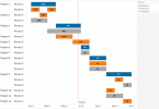
Data visualization is essential to the decision-making process, whether on the business side or for consumers. And the most critical part of the data visualization process is presenting the data clearly and confidently to the audience.

A responsive mobile design for your data visualizations is essential to presenting them. But in today’s modern world, clearly presenting that data is much more complicated than it seems. 59% of global internet traffic is on mobile devices, phones, tablets, and other devices of varying screen sizes.
Responsive Web Design and Data Visualization: Where the Two Connect
Responsive web design is where web pages have more straightforward layouts and structures on mobile devices to make it easier for consumers to digest. Responsive data visualization takes this concept a step further and makes the visualizations easy to read and understand, no matter what device the consumer uses.
This could mean simplifying a complicated graph that presents best on a desktop to a more straightforward design that’s easier to understand on mobile. Or you could flip the axis, have annotations, or even use a different chart altogether.
For example, waterfall charts are great for presenting stock and financial information. However, it can be more challenging to understand on mobile, so that you may switch to a chart graph or other simple representation.
While waterfall charts present a wide breadth of cause and effect information, they can be dense and won’t translate well to mobile design. So you create a separate chart that changes based on what device the user is accessing it from. A simplistic chart for small mobile screens and a more extensive waterfall chart for desktops is the definition of responsive design.
The Principles of Responsive Data Visualization
When designing responsive data visualizations, you should keep some simple principles in mind to develop the most compelling charts. While many ordinary data visualization principles still apply, you should understand what makes designing responsive data visualizations different.
Simplicity for Mobile
Most mobile traffic is online for a few seconds. The person finds what they want, then leaves. For data visualizations, this means getting your point across in as little time as possible.
Keep your visualizations simple and punchy for mobile with a design that helps the user understand what the graph is saying as soon as they look at it because they aren’t going to stay there and spend several minutes trying to decipher small text or minuscule diagrams.
Keep to the main point you’re making, and make it in as little time as possible. Bar graphs, colored maps, and simple line graphs are good visualizations, as they don’t require much space and convey a lot of information.
High-Contrast Colors for Inclusion
So, having an annotation or caption for blind people to listen to only includes one segment of the popular who have problems with visual data. Color blind people, people with poor eyesight, and people with small dark phones are also people you should consider when designing your visualizations.
Using high-contrast colors doesn’t just help people who have trouble seeing it, either. It also makes it easier for people with 20/20 vision to read. And all these people want graphs with high-contrast colors that pop and are easy to decipher.
It also helps keep your charts simple, as using multiple colors is a great way to add even more information to a graph or chart without overwhelming it.
The Process of Responsive Data Visualization
So now that you understand the principles behind responsive data visualization, it’s time to implement them. The typical workflow for designing responsive visualizations is to develop the desktop version first, then create the mobile as an afterthought.
However, this limits creative design regarding mobile devices and different screen resolutions. The mobile design often becomes a miniaturized version of the desktop visualization if it’s even created.
Desktop First vs. Mobile First Mindsets (And Why Mobile Is Best)
Changing your mindset on designing responsive visualizations is the first step you need to begin incorporating the principles into your workflow. Start with thinking about the mobile design, even if most visualization creation applications are designed to have desktop visualizations as the default.
If you start with the desktop, you’ll be thinking about how to dumb the chart down enough that it will fit on a mobile screen. If you start with the mobile, you’ll be considering how to best present the information in an attractive way on mobile screens, which is where creativity thrives.
Artboards on Artboards: Working on Multiple Designs Simultaneously
Most creation applications have different artboards and screens for each separate graph, and to make any changes, you’ll have to go to each board and edit them manually. Yes, horrible, but until a good visualization application that allows you to make several changes to several boards simultaneously, you must suffer for good design.
Updating and editing visualizations as you create them will help you understand what works in each version and what doesn’t and may inspire you to present the information in a better way than before. Plus, it will keep all your visualizations consistent with each other and help you catch any mistakes.
Testing Visualizations on Multiple Devices
When you’ve finished your designs, you should test them on several devices to ensure they look as you intended with no mistakes or unintended snafus.
Many people skip this step and then have to go back and fix something because a chart didn’t work how they wanted on a device. It’s also the perfect time to correct mistakes or minor adjustments so your visualization will look its best.
Responsive Data Visualization: Essential for Businesses
Responsive websites and pages used to be a luxury, something to show that a business was professional. Now they’re a requirement, as most online traffic is mobile, so companies need to adapt.
Responsive data visualization can get your point across quickly and easily and reach your audience on all platforms and devices. You should begin implementing the principles of responsive data visualization into your designs today.


Leave a Comment