I have been working on Tableau since last 5+ years and one of the major issue I have faced so far is- Tableau table conditional formatting.
What I mean to say here is, format the table based on the conditions something like-

Why Tableau table conditional formatting is required?
You might have this question like why you should go for the conditional formatting of tableau tables when many formatting options are available.
So, the answer is pretty simple!
There will be many requirements where you might have to create a summary view of your dataset. And again may have to change the text-color or background-color based on some value in the summary table. For such cases, the conditional formatting of the tableau table is required. Here we will try to solve some of the below questions-
- How to change the text color based on conditions in the Tableau table
- How to change the background color of the summary Tableau table
- How to create a table showing icons for different measures and change the color based on the conditions and many more.
As you can see in all the above 3 questions, one thing is similar and that is color. And there should not be a second thought that color plays an important role in visualization.
Now as you know why the conditional formatting of the Tableau summary table is so important, let’s talk about how to create it.
Steps to create conditional formatting in Tableau summary table
As we are looking to have 4 columns in Tableau summary table and so, we will start with creating 4 dummy variables as shown below.
Download Dataset
Step-1: Create 4 dummy variable
Just create a calculated field and duplicate it 3 times to have 4 columns for the summary table.

And then duplicate the column (column-1) 3 times to have total 4 such columns.

You might change the measure names but I have kept as it is. Ultimately these are dummy and not going to be visible anywhere on the visualization.
Step-2: Add the measure to the column shelf
Now just drag the 4 measure columns created to the column shelf and also ship mode dimension (or any other dimension which is required as per your requirements) to the row shelf.

Just ensure that there are separate placeholder for each measures in the Marks section as shows in the above image. You may also change the worksheet to entire view to look better.
Step-3: Edit the axis and give a suitable title
Now it’s time to work on the axis. You can see currently the default names like column-1, column-1(copy) etc. are written over here. Let’s change this to some meaningful names.
As we are looking for the following in our Tableau summary table-
- Sales
- Profit
- Discount
- Quantity
And so, let’s change all 4 with these valid names.
To do that, right click on each axis and select Edit Axis option.

This will open a popup box and there just edit the name and set the new as per your requirements.

Step-4: Remove major and minor tricks
Yes, on the same above screen, just remove the major and minor tricks. If you don’t have the above screen yet, just right click on the axis again and select edit axis and there select Tricks Marks. And there select None in both major and minor tick marks.

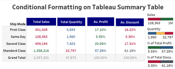
Repeat the above two steps for all the remaining three columns as well. And your report will look like this-

Also Read: 7 Best Tableau Courses
Step-5: Change the marks to Text
Currently, you will find the Marks is showing Automatic for All options. Just change this to Text so that we can have values being displayed for all the four measures.

Step-6: Add require measures to all those 4 columns
Now it’s time to add the measures- Sales, Quantity, Profit, and discount to the 4 columns we have already added.

I have added sales to the first column in both text and color. It’s up to you which one you’re adding to the text and color according to your requirements.
Once done, you will be getting the view like below!

Step-7: Change the color
You can also play around the color and see if you want to make any change. For example, any sales below 500k sales should be red while above should be green.
Similar I have changed profit and discounts to average and have made some color changes as well and the report looks like below.

Also Read: Tableau Project For Practice
Step-8: Add to the dashboard
One problem still I can see is the label showing at the bottom and ideally we all want to show at the top. For this, first add the report to the dashboard.
Later hide the label showing below for all the 4 columns just by right-clicking and unchecking show header.

Step-9: Now add the label by using the Text option of the dashboard
Make the dashboard now as floating and drag the text window and right the suitable title there.

Similarly do this for all the 4 columns and arrange at the top. And your report will look like below-

Step-10: More Formatting
If you want, you may add some more formatting like change the average profit and discount to average % profit and discount. You may also add total to all columns and even change the background a bit.
But remember all these are optional!
Conclusion on Tableau Table Conditional Formatting
These were all about the tableau table conditional formatting. We have tried to create and format the summary table. As shared above, this is the first article in formatting and there will be many more so, stay tunes. You can subscribe to our channel for a video tutorial of this article.


One problem I see with this is when the I publish the dashboard on a site. The floating objects tends to re order or move.